Aya Healthcare Rebrand
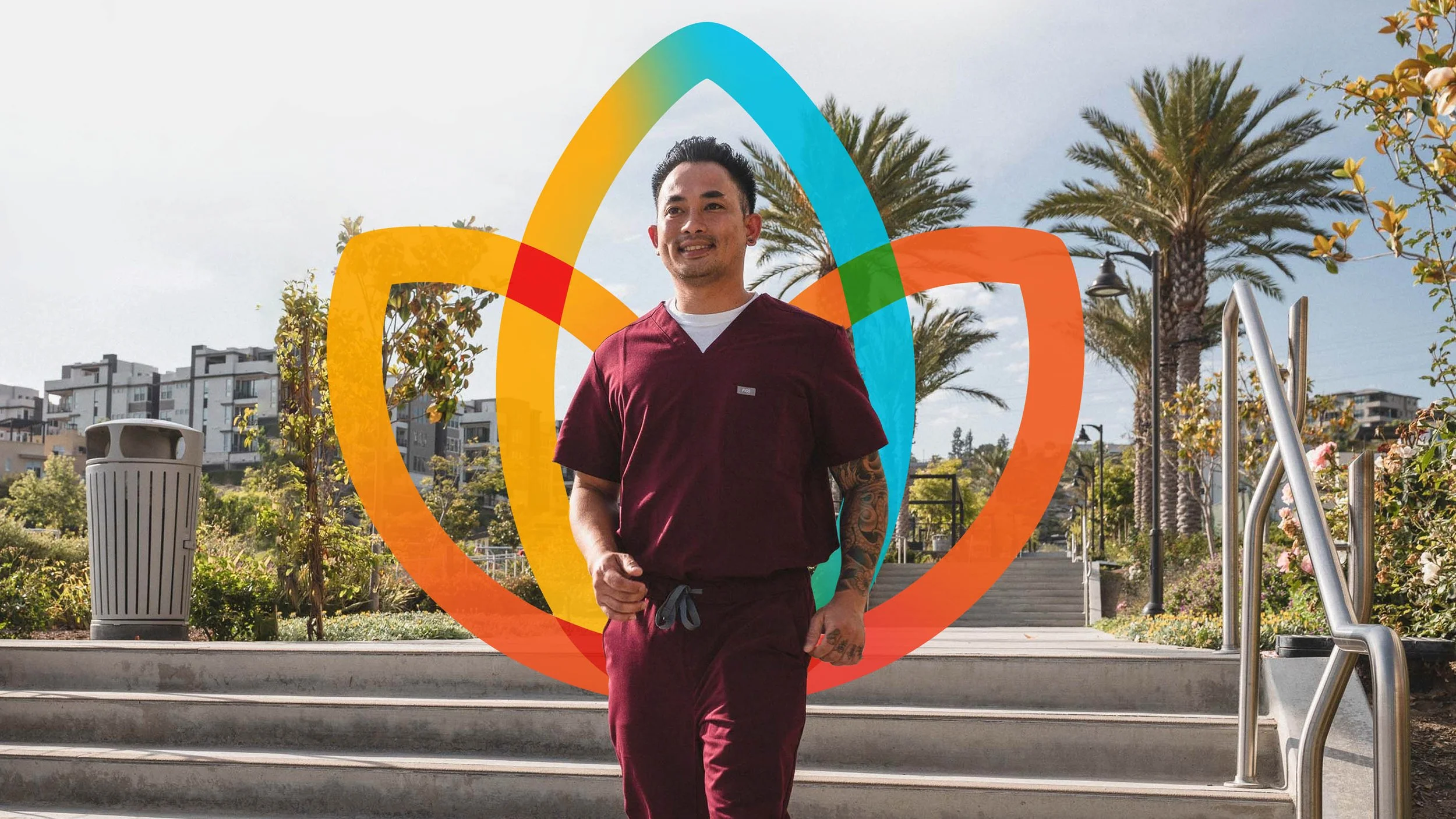
During the COVID surge, Aya Healthcare experienced explosive growth, evolving from a million-dollar business into a billion-dollar one almost overnight. With a massive influx of new clients, the brand saw an opportunity to evolve its identity to feel more tech-forward and modern, while still honoring the equity built around the Aya lotus.
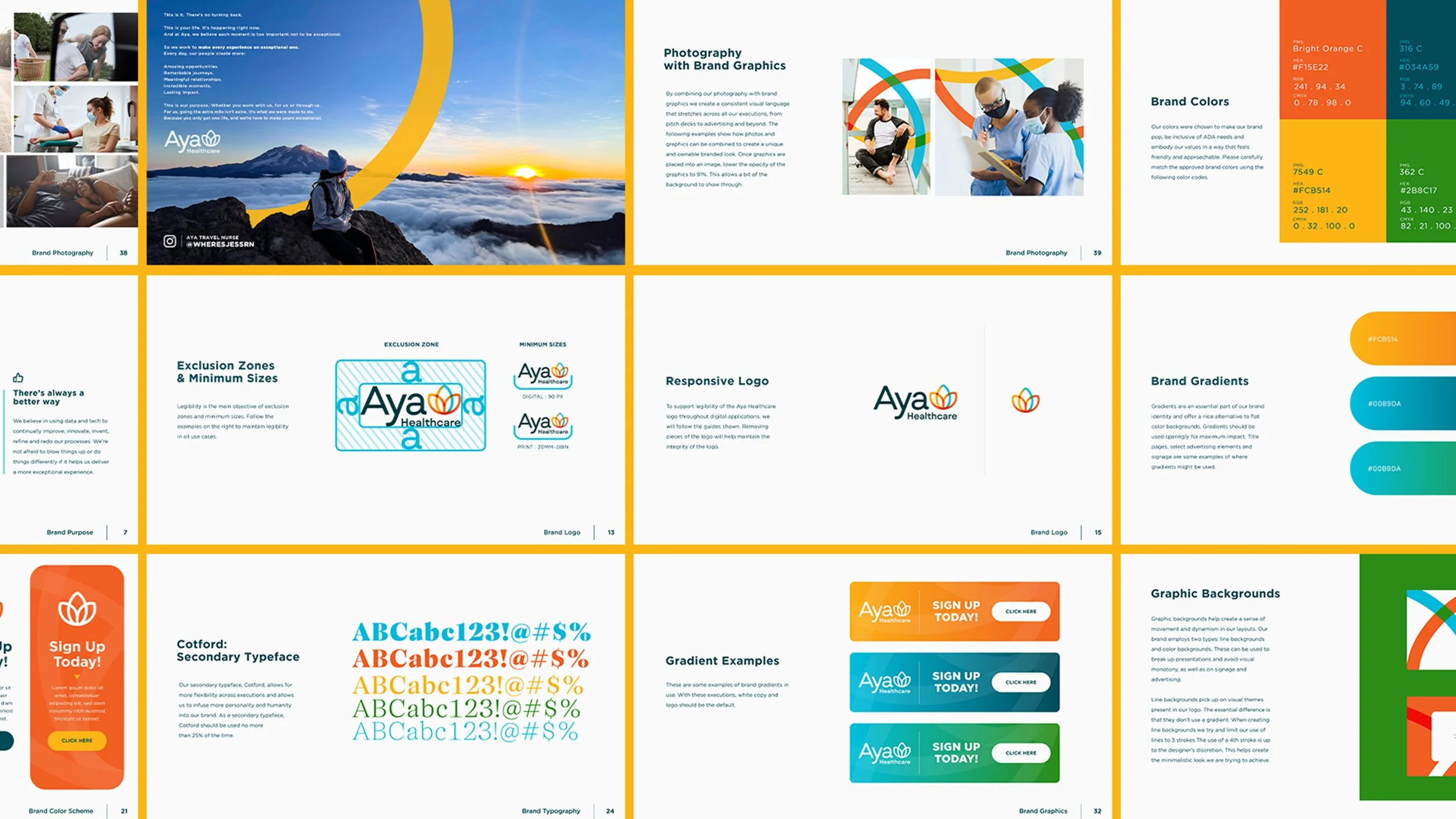
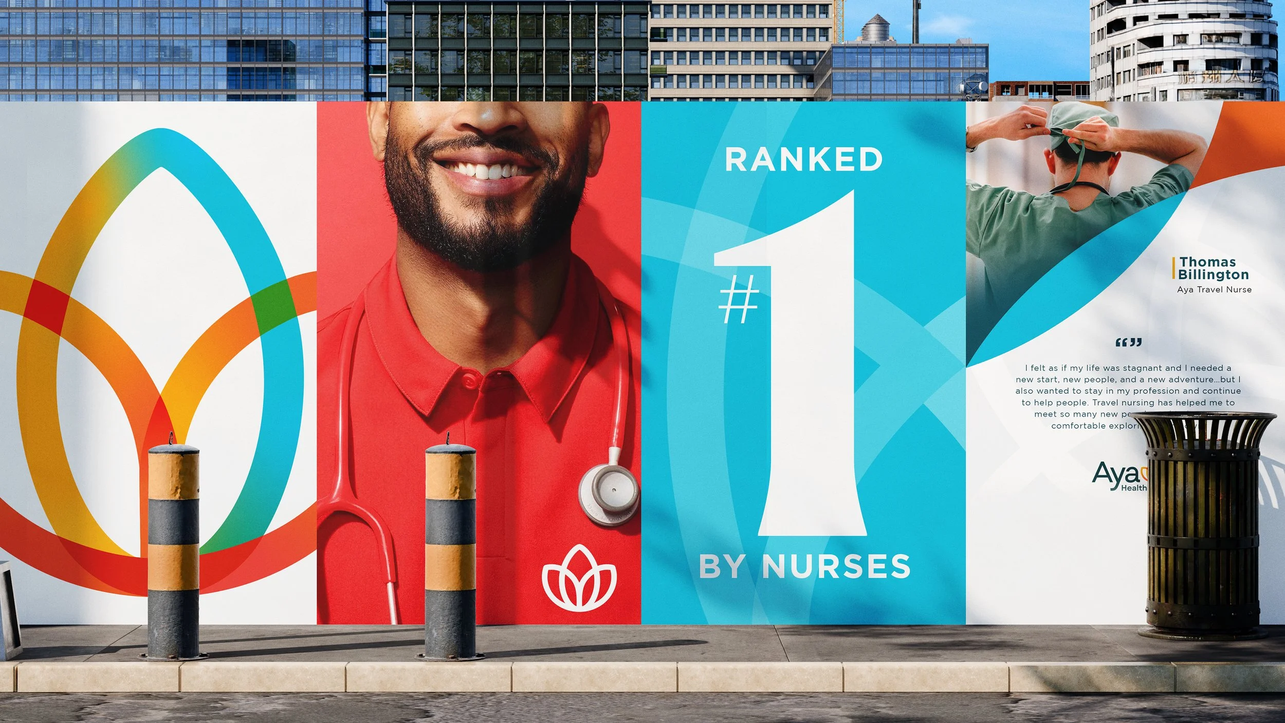
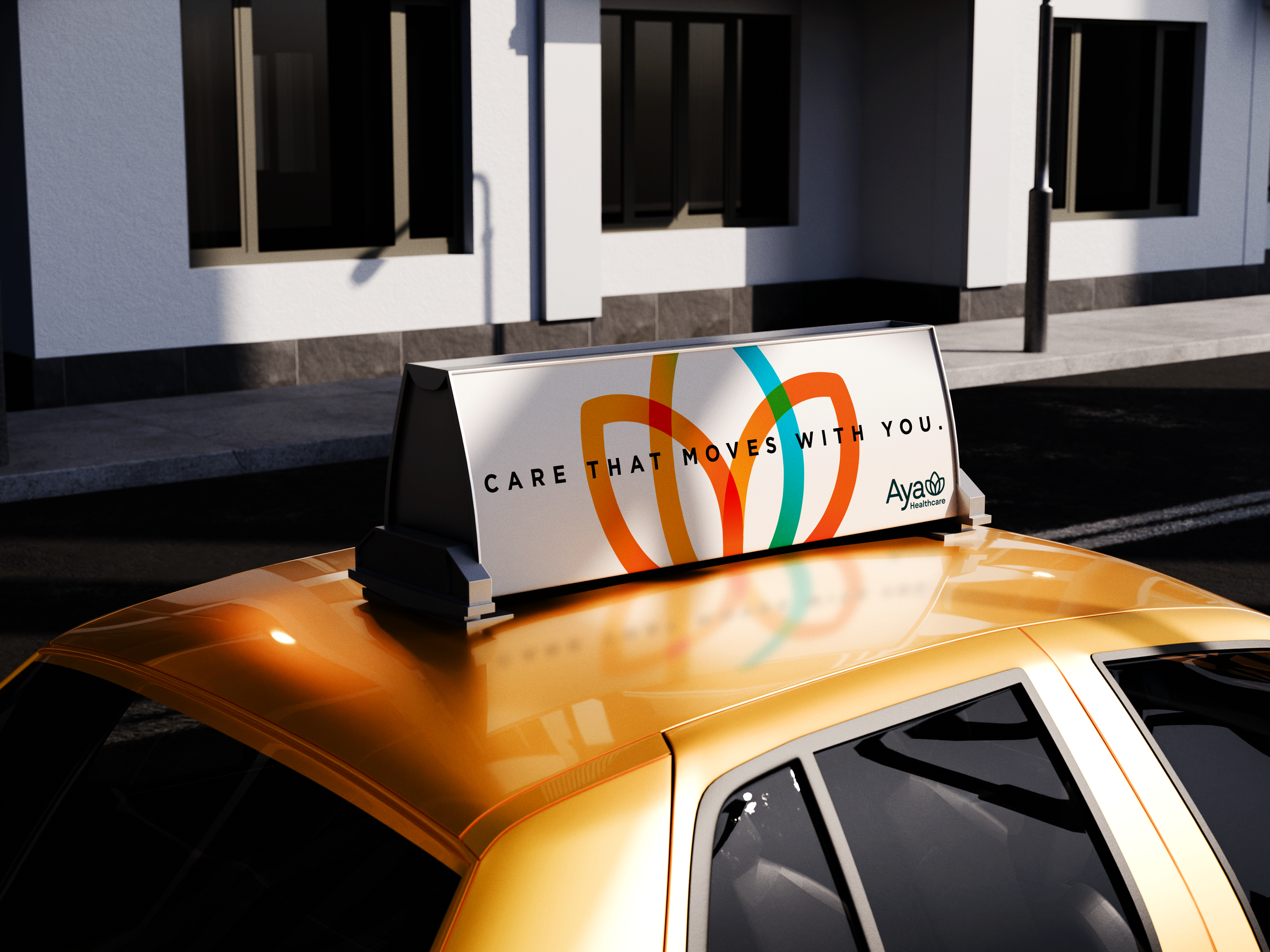
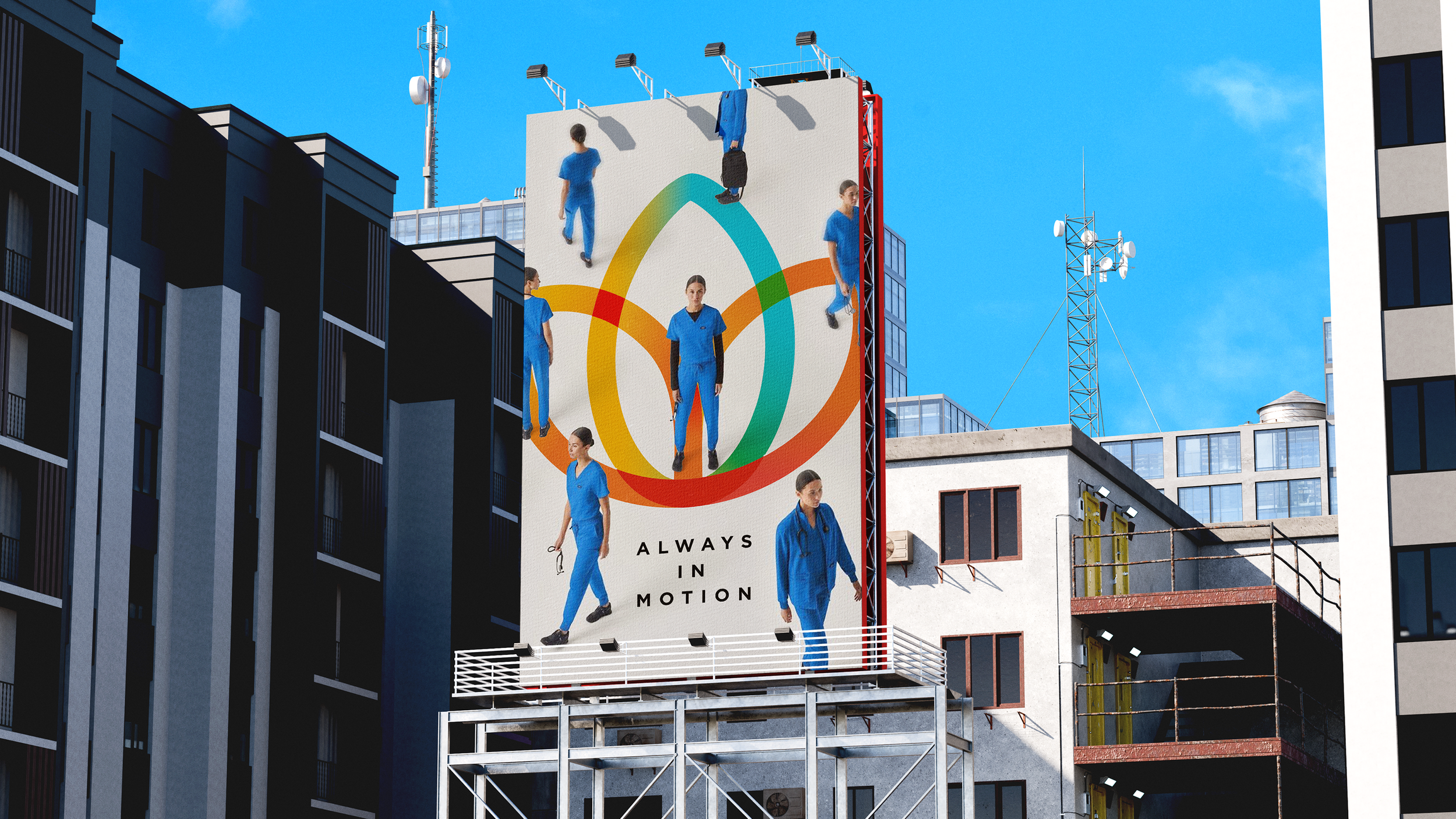
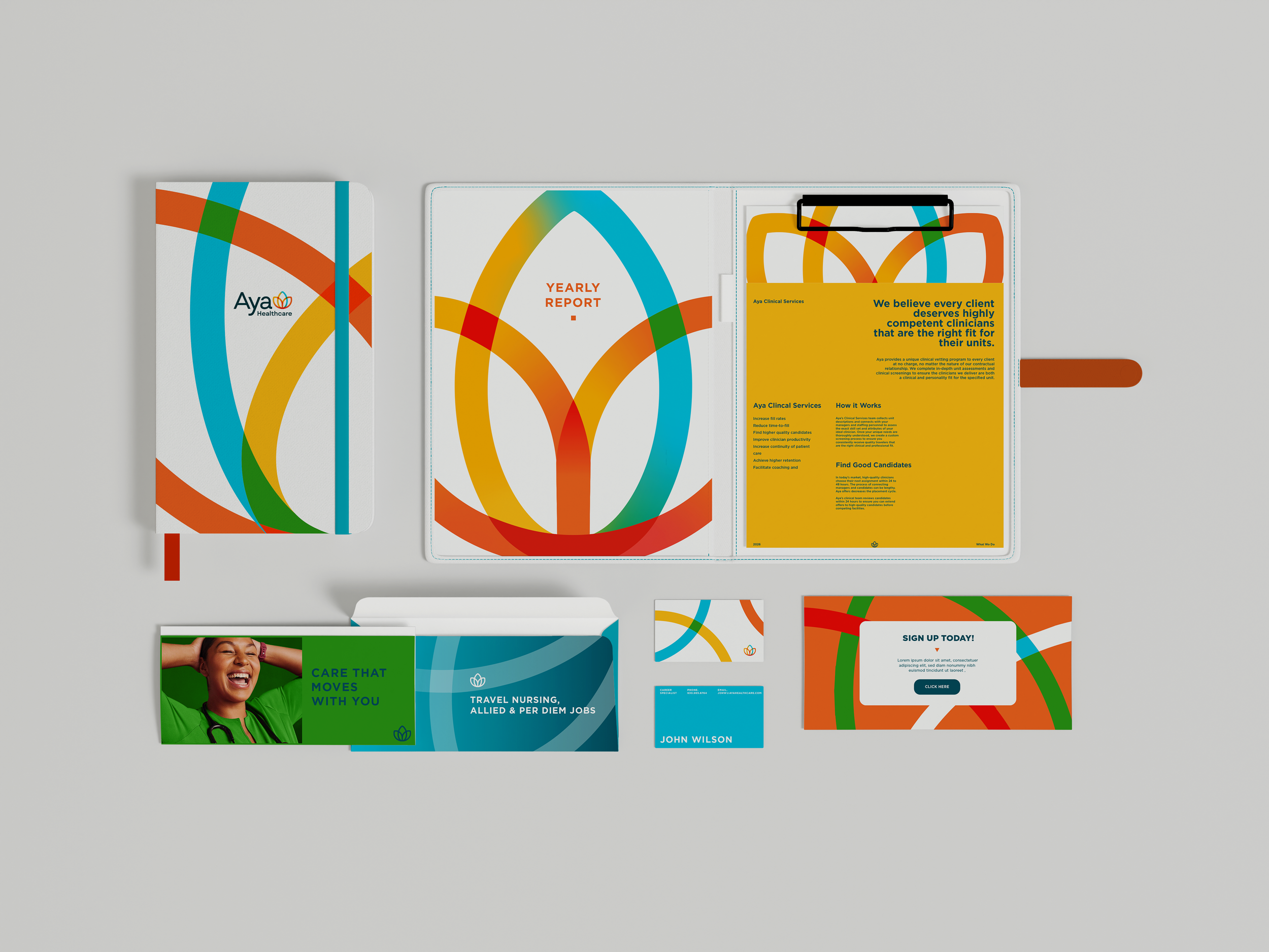
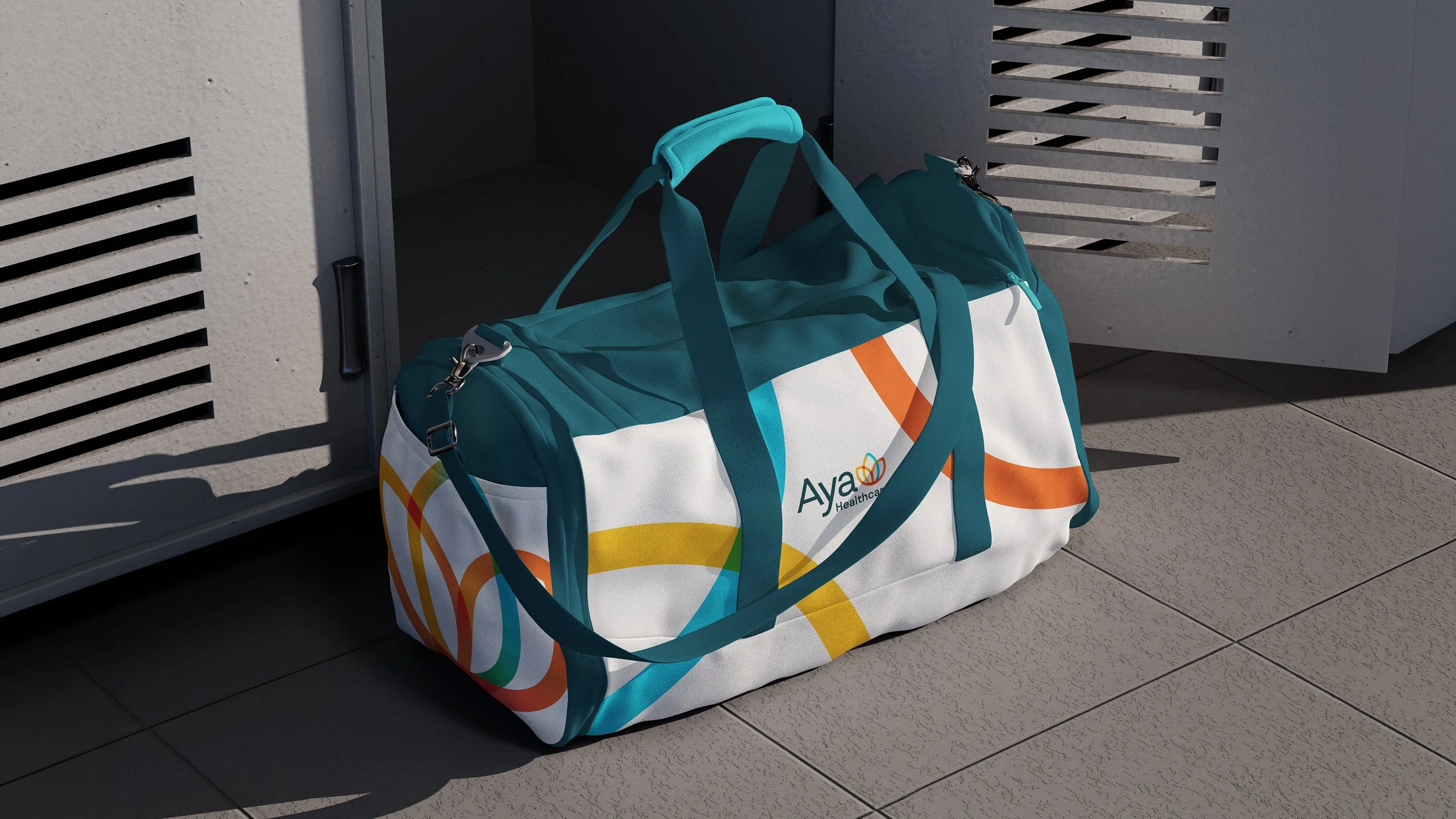
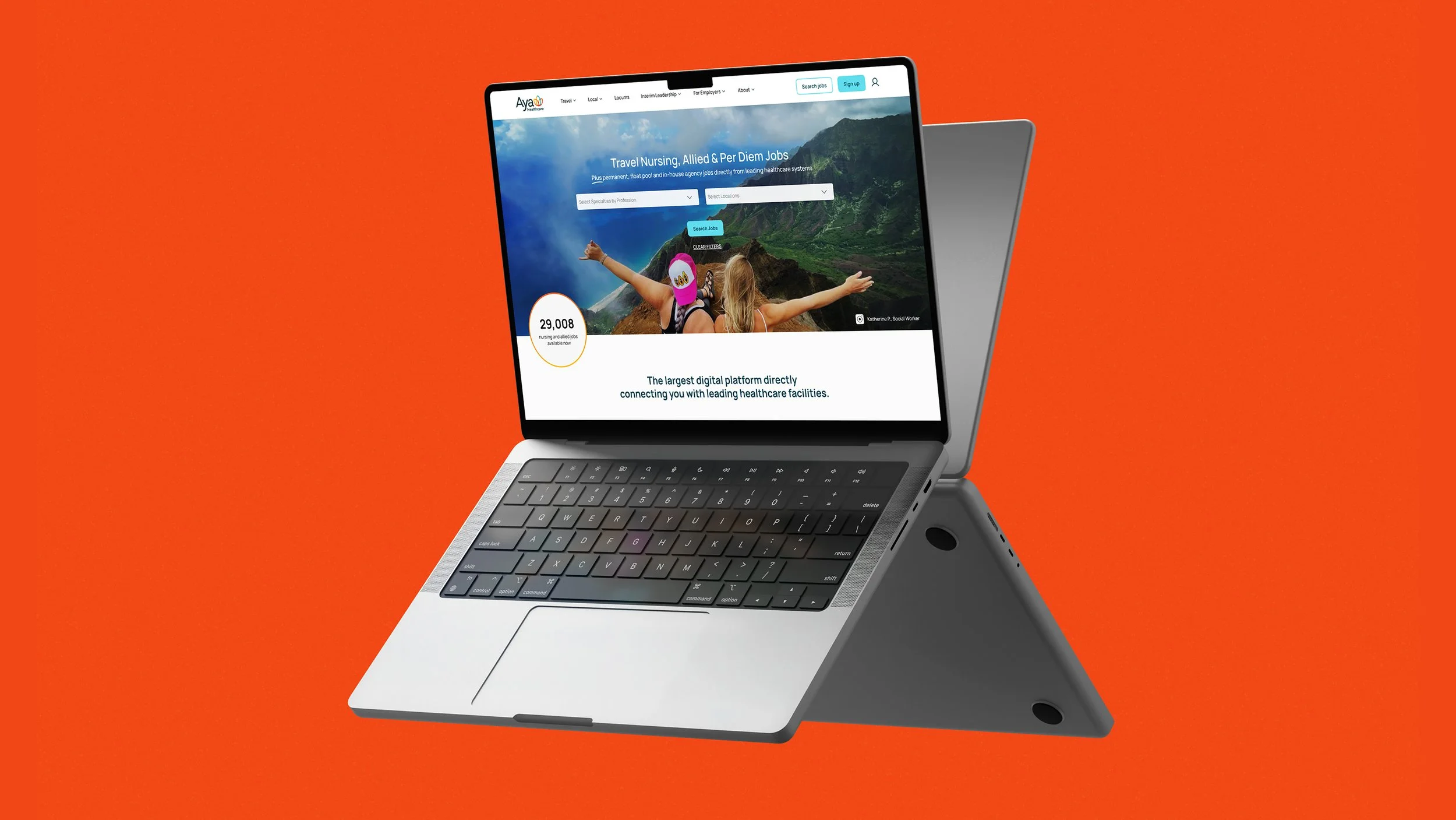
We explored hundreds of iterations of the lotus, refining it until it became something truly distinctive and ownable. From there, we expanded the system across every touchpoint, brand guidelines, OOH, a full website redesign, and social.
The result was a cohesive, future-facing identity that not only matched the company’s scale, but created long-term brand value and a foundation built to last.
Healing the Heart of Healthcare
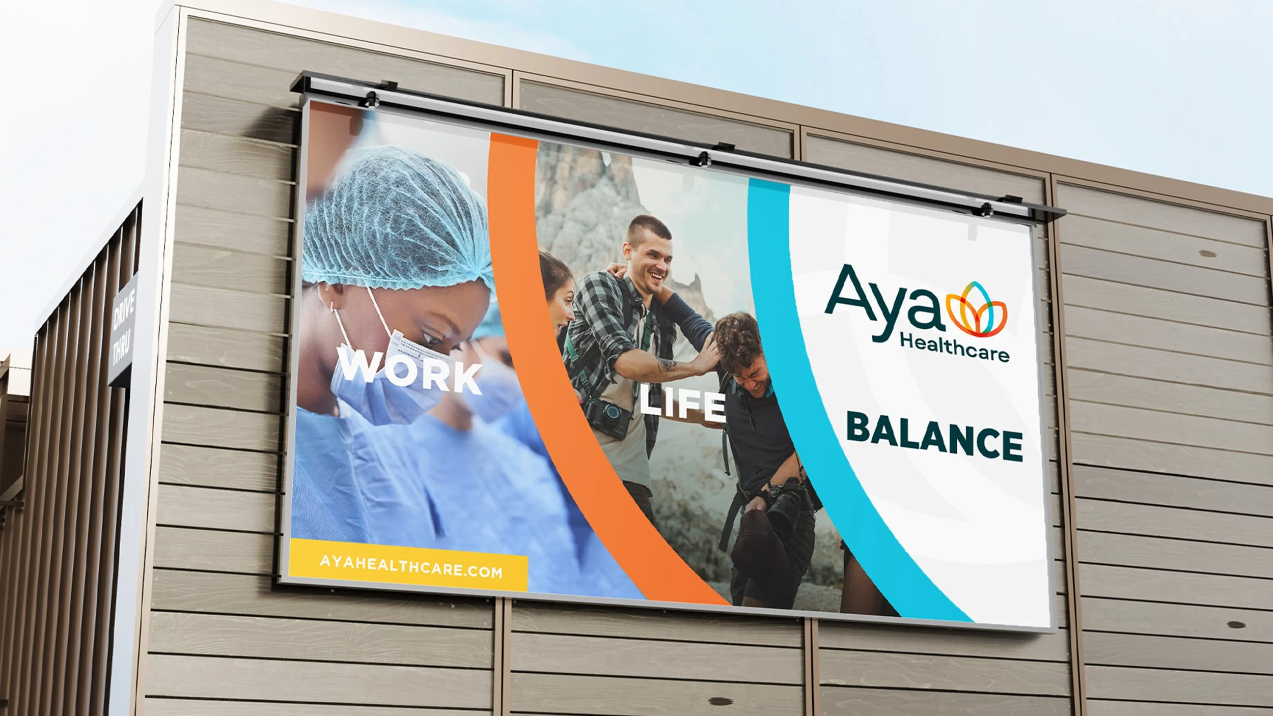
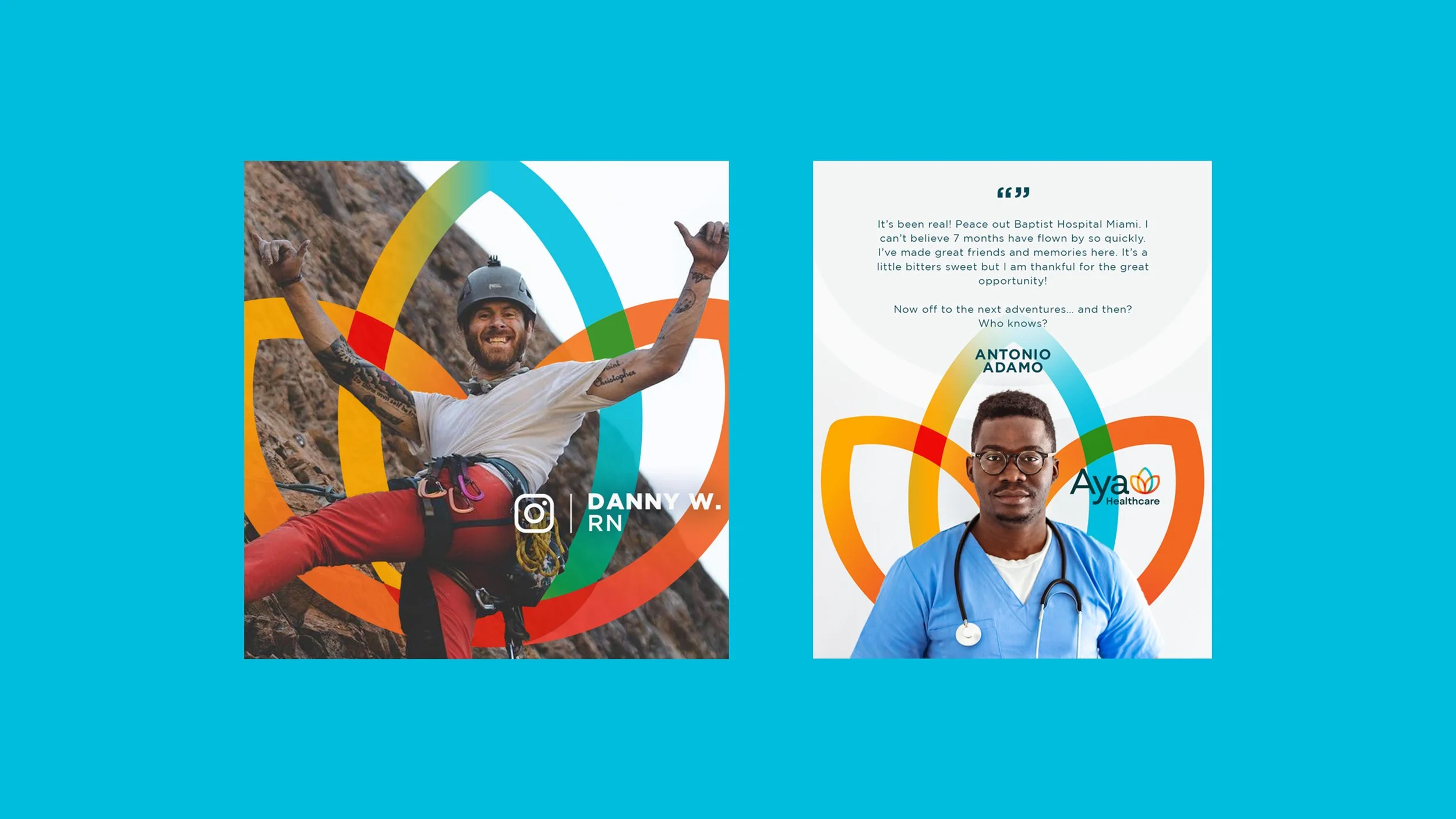
This project is a strong example of how we brought humanity into a tech-forward brand. We set out to create something visually distinct, but grounded in a simple truth, everyone is human. Especially during COVID, it was important to acknowledge that even nurses, the ones doing the healing, need time and space to heal themselves.
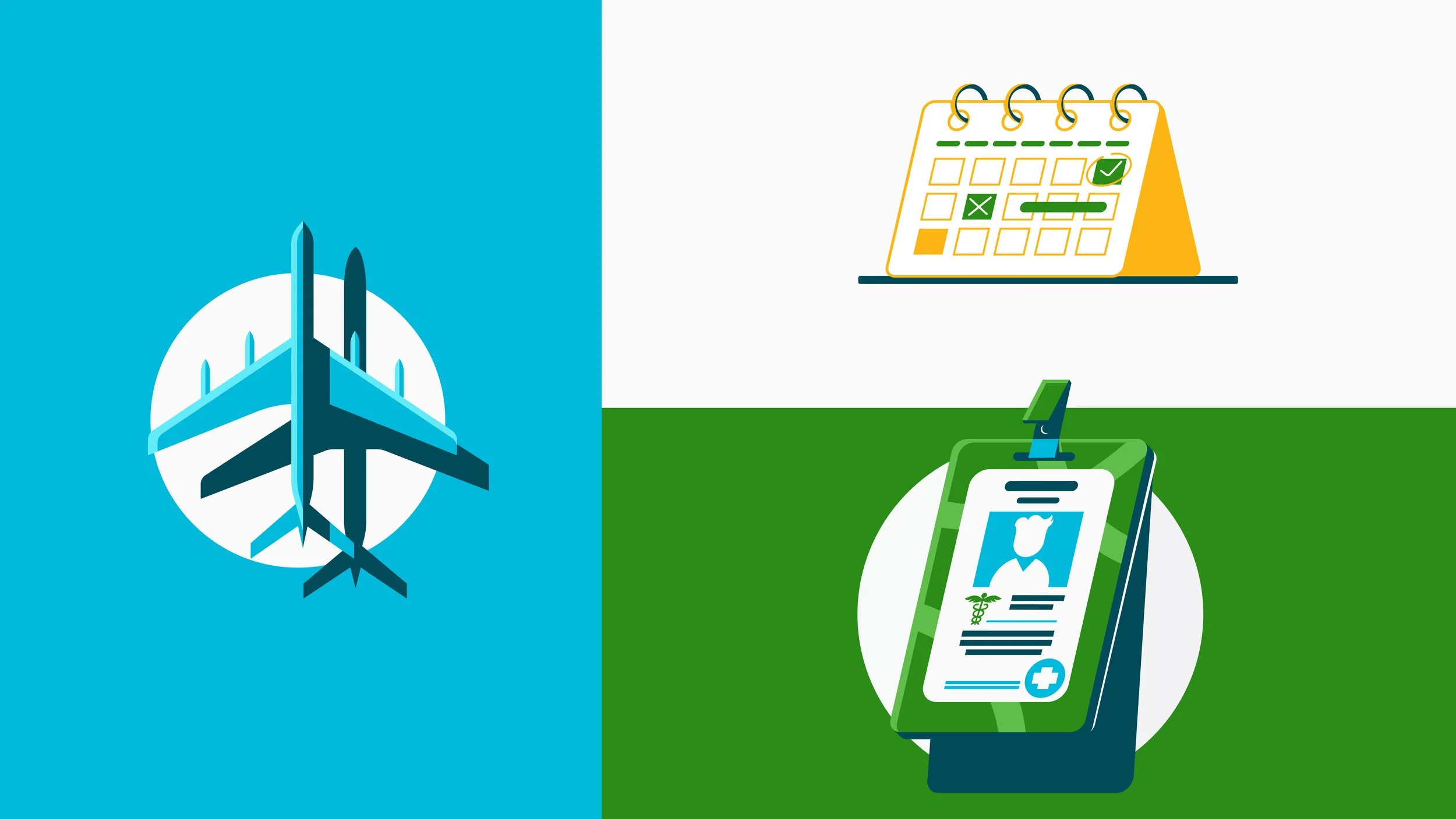
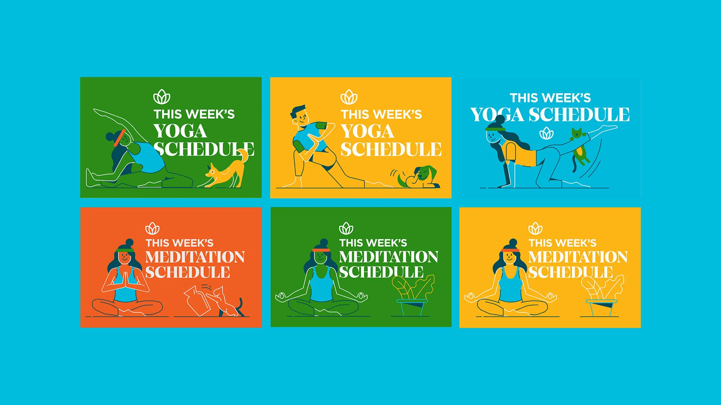
Below, you’ll see how we translated this new identity into a flexible, scalable system, one that could stretch across every touchpoint without losing its integrity. From digital to OOH to social, the framework was built to adapt, evolve, and stay cohesive, ultimately positioning the brand as a recognizable and trusted staple within the travel nursing industry.